
Brand refresh – Environmental Film Festival Australia
Client:
Environmental Film Festival Australia (EFFA)
Brief:
Create a refreshed brand identity and style guide to celebrate the Festival turning 10 years.
Concept/Ideation:
Extensive research on various film festival branding in Australia and overseas was undertaken to distinguish existing brand identities that were already on the market. Initially, a variation of the mountain motif was considered with the addition of a sun/moon motif to represent the natural environment however after much experimentation, this concept was abandoned in favour of a more simplistic brand mark that was not too literal. The eventual direction of the new EFFA brand mark steered away from the previous environmental motif of mountains while still emphasised the letters ‘E-F-F-A’. It was important to distinguish the old brand mark from the new therefore a heavier weight was considered which effectively provided more authority and dominance from a visual standpoint. Reference to film was also incorporated to provide clarity and recognition of what the brand was associated with.
A total three concepts were presented to the client:


The client chose the first option which was the cleanest in design and visually representative of the brand itself. The brand mark could be shortened and a vertical stacked brandmark was also created to be used when space is limited either digitally or in print.


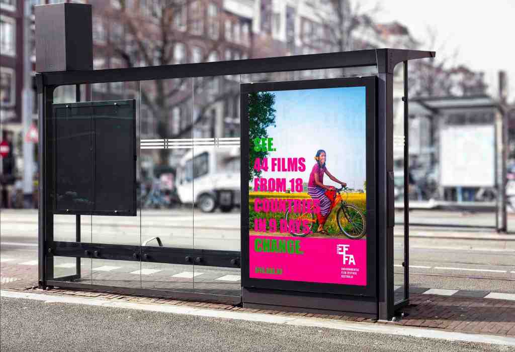
Outcome:
The new brand mark was refreshed and simplified for longevity. Its bold and confident execution demonstrates authority and engagement. EFFA is informative, worldly and inspires hope. The logo is strong and affirmative, contemporary in application without losing its core identity. The visual system connects the viewer with the issues at hand and portrays EFFA as progressive, relevant and a catalyst of change.
An official style guide was created and a colour palette was also devised to be used across EFFA’s marketing campaigns and collateral, website and social media channels.


